Data Analysis Tools - Week3 | Pearson Correlation
This is the third assignment or the second course (of five) Data Analysis and Interpretation Specialization detailed information about it can be seeing here.
Assignment 3:
The third assignment deals with correlation coefficient. A correlation coefficient assesses the degree of linear relationship between two variables. It ranges from +1 to -1. A correlation of +1 means that there is a perfect, positive, linear relationship between the two variables. A correlation of -1 means there is a perfect, negative linear relationship between the two variables. In both cases, knowing the value of one variable, we can perfectly predict the value of the second.
See the entire code for this week here.
Variables
Details of my project can seeing here, to get easier, I made a summary bellow:
| Variable Name | Description |
|---|---|
| Life | Explanatory Variable: Life Expectancy (1) |
| Alcohol | Response Varialbe: Alcohol Consumption (2) |
(1) 2008 alcohol consumption per adult (liters, age 15+)
(2) 2011 life expectancy at birth (years)
Correlation Coeficient
The association between life expectancy and alcohol consumption is very weak (less than 0.5), thus, the square r show us this weakness.
r1 = scipy.stats.pearsonr(data1['life'], data1['alcohol'])
r1 = list(r1)
r1.insert(2,r1[0]*r1[0])
print (tabulate([r1], tablefmt="fancy_grid",
        headers=['Correlation coefficient', 'P-value', 'r²'] ))
| Correlation coefficient | P-value | r² |
|---|---|---|
| 0.312994 | 2.34203e-05 | 0.0979652 |
The correlation is approximately 0.31 with a very small p-value, this indicates that the relationship is statistically significant, but the linear correlation between alcohol consumption and life expectancy is very weak.
The code for this table can seeing in section [2] on this jupyter notebok
Scatter Plot:
To reinforce the results of the correlation coefficient, I plotted the scatter plot, that shows us a positive line that demonstrates the dispersion of dots, indicating the weakness of correlation between the two variables.
scat1 = seaborn.regplot(x="alcohol", y="life", fit_reg=True, data=data1)
plt.xlabel('Alcohol Consumption')
plt.ylabel('Life Expectancy')
plt.title('Scatterplot for the Association Between Life Expectancy and Alcohol Consumption')
plt.show()
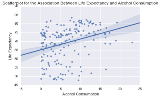
The code for this graph can seeing in section [3] on this jupyter notebok
Conclusion
Although the correlation calculus shows a p-value<0.05 that means to reject the null hypothesis (which says there is no correlation) and accept the alternative hypothesis (which says there is a correlation), indicating a statistical significance. The r value of 0.312994 shows a very modest positive linear correlation between alcohol consumption and life expectancy.
See the entire code for this week here.